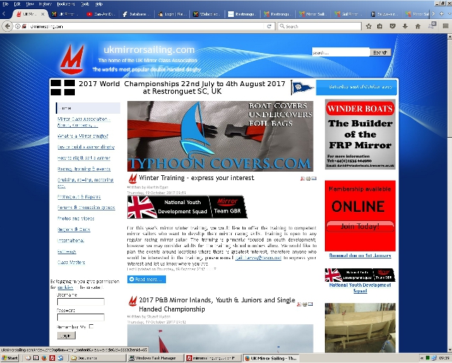
As you can see, the template, which largely controls what the site looks like (i.e. the style), has changed. What's less obvious is that the core Content Managmement System (CMS) software has been updated to the latest version. This should, hopefully, mean an end to the "Database error...." messages we have been suffereing from for the last few months. The content (articles, documents, videos, links, etc.) remains unchanged.
The new template is described as a '...clean, stylish and professionally designed responsive template...'. A responsive template means it '.. will also fit perfectly on all browsers and devices.... Wide, Normal, XTablet, Tablet & Mobile.' So if you view the site on a device with a smaller number of horizontal pixels (e.g. a Mobile in 'portrait', or a small size window on a PC), the display of the site will change to fit the limited width (typically the side bar content will drop to the bottom of the page).
In general I've tried to keep the side bar content the same and in the same positions as with the old template. I've done some testing, but it's always possible I've missed something, so if something does not work in the way you think it should, please let me know.


